My name is Allan MacLeod. I am a forever student and I love environmental research, STEM education, and data-related fields. I recently decided to get serious about pursuing environmental data work, so I created this blog to write about what I am studying and to show the projects I am working on.
Exploring US government mapping efforts: TIGER
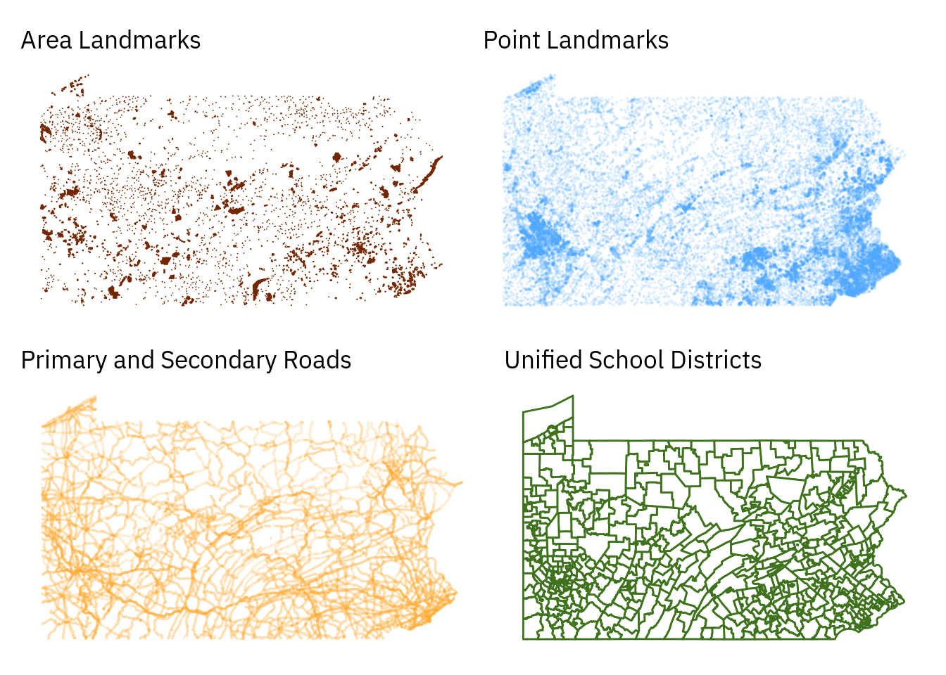
In exploring available geospatial data sets, it’s very quickly apparent that there is a huge amount of information available at no cost and that the limiting factor is not availability and licensing, but knowledge of what data is available and experience in manipulating it. Since I am exploring very unfamiliar terrain by starting to work on cartography, I am not aware of best practices and have no industry knowledge to guide my activities....
Starting with geospatial data in R
When I worked with Leaflet to map the NYC water quality testing stations, I had to learn a bit about how geospatial data is structured in order to transform my data points into a format that I could then plot on a generated Leaflet map. For that task, I did not need to go especially deep into the workings of modern digital cartography because Leaflet has built in access to a range of tile servers....
Creating a ggplot2 theme
As I learn more about exploratory data analysis, I’ve started working with R’s visualization libraries and learning topics like faceting, mapping, and basic interactive tables. As I work with ggplot more, I find myself tweaking the graphics I’ve built quite a bit. In building manual patchwork graphics, this created a lot of repetitive code. Much of this was related to the quirks of the data and was partly unavoidable given my approach, but a lot of duplicated code was produced to manage the theme elements of the plots....
Managing inconsistent facets with Patchwork
As I started visualizing the Current Reservoir Levels data, I realized that a technical issue I was grappling with was interesting in its own right. One of my variables didn’t apply to all of the data, and in order to display data in the way I wanted to, it was necessary to build a custom plot. I explored the inbuild ggplot2 options and tried to visualize the inbuilt faceting feature, but due to the inconsistent nature of my data facets I ended up using patchwork to build the plot exactly as I wanted it to be....
Learning the basics of GIS mapping with Leaflet
To learn more about creating interactive visualizations, I am going to use the Leaflet library to map the locations of New York City’s water quality sampling stations. These sites feed into at least two data sets of interest, the Drinking Water Quality Distribution Monitoring Data and the Distribution Sites LCR Monitoring Results. Glancing at the data The data sets come with a data dictionary, which I will import and examine with head():...