In exploring available geospatial data sets, it’s very quickly apparent that there is a huge amount of information available at no cost and that the limiting factor is not availability and licensing, but knowledge of what data is available and experience in manipulating it.
Since I am exploring very unfamiliar terrain by starting to work on cartography, I am not aware of best practices and have no industry knowledge to guide my activities. Until I make some time to intentionally research what learning activities are efficient, I am exploring very much out of curiosity. To that end, I’d like to explore building maps as an unstructured exercise.
Narrowing focus
At this point, I have some basic ideas of how geospatial data is structured and how to approach a project, but I’m unfamiliar with the mapping resources available and how to use them.
When exploring a new topic, it’s helpful to connect it with a familiar topic to give some sense of anchoring. While I would eventually like to explore the entire world, I will start with the town of Beaver, Pennsylvania, where I grew up. I’ll also focus on open source data from US government agencies, since they are major creators of mapping assets.
From what I can tell with some basic exploration, it seems that there are two major agencies producing non-classified general mapping products. The National Geospatial-Intelligence Agency presumably produces maps, but none of these appear to be publicly available.
- The Census Bureau’s TIGER
- The US Geological Survey’s US Topo topgraphic maps and The National Map (TNM)
These two are not mutually exclusive, and the two agencies regularly share data and collaborate with each other. Many other agencies also have mapping efforts for more specific purposes and often include viewers to visualize their data sets that use USGS Topo or Census TIGER data as the base map to display basic map features.
Here are a few examples:
- The National Oceanic and Atmospheric Administration’s National Centers for Environmental Information (NCEI) publishes petabytes of environmental data
- The Energy Information Administration (EIA) publishes maps related to energy use
- The Federal Emergency Management Agency (FEMA) publishes the National Flood Hazard Layer (NFHL) that is used as the basis for flood insurance rates, making it a very politically consequential data set. Notably, it is described as a layer rather than as a map
- The Bureau of Land Management (BLM) publishes some map layers related to the lands it manages, which are located mostly in the western half of the country
This list is not exhaustive and there are many other agencies that create and publish geospatial data in the form of layers. The agencies of the Federal Statistical System mostly all produce maps, and the Multi-Resolution Land Characteristics (MRLC) consortium works on land cover data.
The Department of Defense, if their geospatial work is like everything else the DoD does, probably has seven or eight components doing GIS work in addition to the NGA and each of these duplicate each other’s efforts while seeking to be the apex agency coordinating GIS policy for the entire DoD.
There are quite a few of agencies creating mapping data, and these often overlap with each other. That said, for general mapping purposes the USGS’ TNM/Topo and the Census’ TIGER are the two major national mapping efforts that include a full range of basic layers and details that other maps can be built on top of.
It makes sense to be familiar with these data sources for creating maps of areas located in the United States.
Tile servers, redrawing, and computer resources
As I have started exploring the USGS and Census map data portals and doing basic exploratory plots, my immediate observation is that these data sets are gigantic. I remember learning back when Google Maps became popular that mapping services do not use the map layers directly for the tile servers that underlie modern mapping applications.
Instead, on the back end the maintainers create huge numbers of tiles in raster format that combine all the layers to be used, and these raster tiles (i.e. static images) are what the servers actually send to users. When users zoom in, a new raster image is served that represents the correct resolution.
Older GPS mapping devices used vector maps and drew them out when you booted up the map to navigate. While many layers exist in raster format, particularly satellite imagery, vector form is very common. Even when purely raster data is used, multiple layers being rendered each time users interact with the map is computationally very taxing.
Vector data, which is at its basic level a list of points that can be drawn at any scale, can very quickly reach into the millions of points. When the NOAA says it makes petabytes of data available, this is not hard to believe given the size of the planet and the great size of even well-compressed geospatial data.
I am not especially knowledgeable about efficiency and optimization of code, and my computer has an above average amount of RAM (40 gigabytes), but I can tell it will not be difficult to crash my system if I am not mindful of the size of these sets. After loading my base system and three map layers, I have used 9.8 gigs and both plotly and ggplot2 are operating quite slowly.
It seems that being targeted and deliberate when mapping is necessary, since the unfocused exploration I am used to when using tile servers is not practical given the size of the files in question. I will have to get the specific file or files I need and methodically build the maps I want to. So how do I use TIGER and TNM to access the files I want?
To start, I will focus on TIGER and then address TNM in a separate post. They are both large enough to warrant their own exploratory posts. I will also not give exact instructions for how to get the shapefiles from the USGS and Census bueau websites for a specific reason.
US government websites are almost as bad about breaking their links with updates and changing their user interfaces as Microsoft, so any instructions I write will likely be outdated within weeks. US government websites are great examples of how to design a website if you don’t want your users to find anything.
Instead, I’ll write in more general terms about how the data sources are built and what they contain, factors which do not change as frequently. I will leave the specifics as a Google Fu exercise, as modern search engine algorithms are a much more efficient way to find the information you are seeking than manually maintained site maps.
Accessing TIGER
The structure of the TIGER data is a little simpler for my purposes, so I’ll start with it. The Geography Program portal has options to access shapefile downloads from a web interface or FTP (File Transfer Protocol) portal. The FTP option is somewhat hilarious, but don’t use it.
If you were born after 1980, you’ve probably never used FTP. In its heyday, it was used heavily for pirating mp3 music files, games, and proprietary software before Napster was invented in 1999. Support for FTP has been dropped by all modern browsers, and I wouldn’t be surprised if the protocol has unpatched zero day security exploits. Let’s use the web interface instead.
Being a product of the Census Bureau, the purpose of TIGER is to facilitate the census taken every 10 years and help the public make use of the agency’s data. This means that most of the information in TIGER data sets is about administrative divisions, unlike the US Geological Survey’s TNM which is mainly concerned with the physical world.
These include state, county, tribal, and other political boundaries, but also census blocks, school districts, legislative districts, voting districts, Congressional districts, city boundaries, and statistical areas (metropolitan areas, micropolitan areas, Combined Statistical Areas (CSA), and Core Based Statistical Areas (CBSAs)).
These administrative divisions, and physical features including coastline, landmarks, roads, rails, military installations, and water, are the types of layers available for download and each layer is updated annually. Files are downloaded as zip archives that include a range of types from the TIGER Shapefile download page.
These archives are what we will be working with, so let’s begin exploring the data.
Structure and contents of TIGER shapefile archives
The Library of Congress ESRI Shapefile description page has a great history and explanation of the format and the different types of files that are found in a shapefile directory. For our purposes in R, files with .shp extensions are the only type that matters.
As I mentioned above, we will be focusing on Beaver County, which is in the state of Pennsylvania. TIGER internally uses FIPS codes to represent items in a standardized way, so 42 represents Pennsylvania and 007 represents Beaver County.
Getting the data we want is not as simple as just downloading all the shapefiles for Beaver County, however. Shapefiles for different layer types are not consistent about whether they show data at the national, state, or county level.
The scale shown seems to be based on file size and number of points, with layers consisting of a smaller number of points (like rails and coastlines) shown at the national level, and more dense data (like secondary roads and waterways) shown at the county level.
It’s worthwhile to reiterate here that national data particularly can get very large and resource intensive. The .shp file for US county boundary data is just under 130 megabytes on disk, but when I draw on my system RAM usage spikes to over 12 gigabytes at various points and my CPU temperature goes very high.
Definitely be mindful of how resource intensive these large drawing operations can become and treat your system accordingly. If you use try to perform a task that requires more RAM than your system has available, it may fail and your computer can crash. Most CPUs have a temperature where they will shut down to prevent damage, usually in the 100 degrees Celsius range. Cooking your CPU by running it in this range is not advisable.
National level layers
We’ll start by looking at the national data layers, and load the shapefiles using sf::st_read(). I’ve suppressed the st_read() lines below because they generate a lot of console output, but anywhere a variable titled sf shows up below, it represents an sf object read in using st_read(). The more verbose source document for this page is also available here.
The variables in each layer are not standardized throughout TIGER, so each layer must be analyzed individually. For instance, the national county boundary shapefile helpfully contains columns for state and county IDs:
| STATEFP | COUNTYFP | COUNTYNS | GEOID | NAME | NAMELSAD | LSAD | CLASSFP | MTFCC | CSAFP | CBSAFP | METDIVFP | FUNCSTAT | ALAND | AWATER | INTPTLAT | INTPTLON | geometry |
|---|---|---|---|---|---|---|---|---|---|---|---|---|---|---|---|---|---|
| 31 | 039 | 00835841 | 31039 | Cuming | Cuming County | 06 | H1 | G4020 | NA | NA | NA | A | 1477645345 | 10690204 | +41.9158651 | -096.7885168 | MULTIPOLYGON (((-97.01952 4… |
| 53 | 069 | 01513275 | 53069 | Wahkiakum | Wahkiakum County | 06 | H1 | G4020 | NA | NA | NA | A | 680976231 | 61568965 | +46.2946377 | -123.4244583 | MULTIPOLYGON (((-123.4364 4… |
| 35 | 011 | 00933054 | 35011 | De Baca | De Baca County | 06 | H1 | G4020 | NA | NA | NA | A | 6016818946 | 29090018 | +34.3592729 | -104.3686961 | MULTIPOLYGON (((-104.5674 3… |
| 31 | 109 | 00835876 | 31109 | Lancaster | Lancaster County | 06 | H1 | G4020 | 339 | 30700 | NA | A | 2169272970 | 22847034 | +40.7835474 | -096.6886584 | MULTIPOLYGON (((-96.91075 4… |
| 31 | 129 | 00835886 | 31129 | Nuckolls | Nuckolls County | 06 | H1 | G4020 | NA | NA | NA | A | 1489645188 | 1718484 | +40.1764918 | -098.0468422 | MULTIPOLYGON (((-98.27367 4… |
| 72 | 085 | 01804523 | 72085 | Las Piedras | Las Piedras Municipio | 13 | H1 | G4020 | 490 | 41980 | NA | A | 87748418 | 32509 | +18.1871483 | -065.8711890 | MULTIPOLYGON (((-65.91048 1… |
| 46 | 099 | 01265772 | 46099 | Minnehaha | Minnehaha County | 06 | H1 | G4020 | NA | 43620 | NA | A | 2089701439 | 18188795 | +43.6674723 | -096.7957261 | MULTIPOLYGON (((-96.89022 4… |
| 48 | 327 | 01383949 | 48327 | Menard | Menard County | 06 | H1 | G4020 | NA | NA | NA | A | 2336237980 | 613559 | +30.8852677 | -099.8588613 | MULTIPOLYGON (((-99.82187 3… |
| 06 | 091 | 00277310 | 06091 | Sierra | Sierra County | 06 | H1 | G4020 | NA | NA | NA | A | 2468694582 | 23299110 | +39.5769252 | -120.5219926 | MULTIPOLYGON (((-120.6556 3… |
| 21 | 053 | 00516873 | 21053 | Clinton | Clinton County | 06 | H1 | G4020 | NA | NA | NA | A | 510875757 | 21152699 | +36.7272577 | -085.1360977 | MULTIPOLYGON (((-85.2391 36… |
| 39 | 063 | 01074044 | 39063 | Hancock | Hancock County | 06 | H1 | G4020 | 534 | 22300 | NA | A | 1376124980 | 6021322 | +41.0002170 | -083.6659471 | MULTIPOLYGON (((-83.88076 4… |
| 48 | 189 | 01383880 | 48189 | Hale | Hale County | 06 | H1 | G4020 | 352 | 38380 | NA | A | 2602109423 | 246678 | +34.0684364 | -101.8228879 | MULTIPOLYGON (((-102.0874 3… |
| 01 | 027 | 00161539 | 01027 | Clay | Clay County | 06 | H1 | G4020 | NA | NA | NA | A | 1564255426 | 5281616 | +33.2703999 | -085.8635254 | MULTIPOLYGON (((-85.97879 3… |
| 48 | 011 | 01383791 | 48011 | Armstrong | Armstrong County | 06 | H1 | G4020 | 108 | 11100 | NA | A | 2354617585 | 12183672 | +34.9641790 | -101.3566363 | MULTIPOLYGON (((-101.6251 3… |
| 39 | 003 | 01074015 | 39003 | Allen | Allen County | 06 | H1 | G4020 | 338 | 30620 | NA | A | 1042587389 | 11152061 | +40.7716274 | -084.1061032 | MULTIPOLYGON (((-84.39719 4… |
| 13 | 189 | 00348794 | 13189 | McDuffie | McDuffie County | 06 | H1 | G4020 | NA | 12260 | NA | A | 666590014 | 23114032 | +33.4806126 | -082.4795333 | MULTIPOLYGON (((-82.44998 3… |
| 55 | 111 | 01581115 | 55111 | Sauk | Sauk County | 06 | H1 | G4020 | 357 | 12660 | NA | A | 2153686013 | 45692969 | +43.4280010 | -089.9433184 | MULTIPOLYGON (((-90.19196 4… |
| 05 | 137 | 00069902 | 05137 | Stone | Stone County | 06 | H1 | G4020 | NA | NA | NA | A | 1570673294 | 8145444 | +35.8570011 | -092.1404819 | MULTIPOLYGON (((-92.41528 3… |
| 41 | 063 | 01155135 | 41063 | Wallowa | Wallowa County | 06 | H1 | G4020 | NA | NA | NA | A | 8147835333 | 14191752 | +45.5937530 | -117.1855796 | MULTIPOLYGON (((-117.7475 4… |
| 42 | 007 | 01214112 | 42007 | Beaver | Beaver County | 06 | H1 | G4020 | 430 | 38300 | NA | A | 1125854819 | 24162295 | +40.6841401 | -080.3507209 | MULTIPOLYGON (((-80.51896 4… |
These columns make it easy to filter for Pennsylvania and Beaver County. Thus filtered, simple maps are easy to build:
pa <- sf %>%
  filter(STATEFP == '42')

bc <- sf %>%
  filter(STATEFP == '42' & COUNTYFP == '007')

pa <- pa %>%
  ggplot() +
  geom_sf(fill = "#fef5e7") +
  coord_sf(
    datum = sf::st_crs(4326)
  ) +
  labs(title = "Pennsylvania Boundaries by County")

bc <- bc %>%
  ggplot() +
  geom_sf(
    fill = "#fef5e7"
    ) +
  coord_sf(
    datum = sf::st_crs(4326)
  ) +
  labs(title = "Beaver County Boundaries")

# Use the Patchwork library to combine plots
pa | bc
Most of the other columns in the data don’t have obvious meanings and I’m not sure exactly how to determine what variables like MTFCC mean at the moment. I’m guessing there is a data dictionary available somewhere that breaks down these variables (or Google), but for our immediate, exploratory purposes here the polygons are what we are looking for.
Other national sets are less clear cut. The military installations layer, for instance, doesn’t include any information that could be used to easily tie these installations to the state or county level:
| ANSICODE | AREAID | FULLNAME | MTFCC | ALAND | AWATER | INTPTLAT | INTPTLON | geometry |
|---|---|---|---|---|---|---|---|---|
| NA | 110509768024 | Tripler Army Medical Ctr | K2110 | 1443458 | 0 | +21.3620086 | -157.8896492 | MULTIPOLYGON (((-157.8982 2… |
| NA | 110507841923 | Ng Havre de Grace Mil Res | K2110 | 304109 | 0 | +39.5327115 | -76.1041621 | MULTIPOLYGON (((-76.11008 3… |
| NA | 110509768183 | Aliamanu Mil Res | K2110 | 2104133 | 0 | +21.3609483 | -157.9117716 | MULTIPOLYGON (((-157.9238 2… |
| NA | 110509768096 | Waianae-Kai Mil Res | K2110 | 34407 | 0 | +21.4469221 | -158.1909990 | MULTIPOLYGON (((-158.1931 2… |
| NA | 110509768142 | Schofield Barracks Mil Res | K2110 | 20509112 | 0 | +21.4993768 | -158.0824984 | MULTIPOLYGON (((-158.1151 2… |
| NA | 110509768059 | Helemano Mil Res | K2110 | 1204608 | 0 | +21.5361123 | -158.0194801 | MULTIPOLYGON (((-158.0267 2… |
| NA | 1108310928834 | West Point Mil Res | K2110 | 52799640 | 2434478 | +41.3590138 | -74.0322985 | MULTIPOLYGON (((-74.10504 4… |
| NA | 1108310958136 | Ng Florence Mil Res | K2110 | 75993617 | 0 | +33.1375881 | -111.3291098 | MULTIPOLYGON (((-111.3878 3… |
| NA | 110509767829 | Makua Mil Res | K2110 | 17406401 | 0 | +21.5307680 | -158.2068764 | MULTIPOLYGON (((-158.2406 2… |
| NA | 110435324283 | Stone Ranch Mil Res | K2110 | 7440946 | 0 | +41.3654109 | -72.2716641 | MULTIPOLYGON (((-72.26356 4… |
| NA | 1108310660208 | Ng Mta Gunpowder Mil Res | K2110 | 1032570 | 10372 | +39.4306656 | -76.5068215 | MULTIPOLYGON (((-76.51083 3… |
| NA | 1108301385692 | Ng Papago Mil Res | K2110 | 1844509 | 0 | +33.4673291 | -111.9621997 | MULTIPOLYGON (((-111.9698 3… |
| NA | 110159819765 | Keaukaha Mil Res | K2110 | 2450860 | 0 | +19.7068079 | -155.0391915 | MULTIPOLYGON (((-155.0528 1… |
| NA | 1104755641127 | Stone Ranch Mil Res | K2110 | 178929 | 0 | +41.3516867 | -72.2836503 | MULTIPOLYGON (((-72.2868 41… |
| NA | 1108311012199 | Thunderbird Youth Acdmy | K2110 | 2335010 | 38530 | +36.2981857 | -95.2927873 | MULTIPOLYGON (((-95.30986 3… |
| NA | 110443570421 | Offutt AFB | K2110 | 7233193 | 513297 | +41.1178814 | -95.9065457 | MULTIPOLYGON (((-95.92719 4… |
| NA | 110510128963 | Macdill AFB | K2110 | 21499446 | 1412049 | +27.8491777 | -82.5107811 | MULTIPOLYGON (((-82.53755 2… |
| NA | 110760434687 | Langley AFB | K2110 | 11687672 | 104265 | +37.0856955 | -76.3635705 | MULTIPOLYGON (((-76.38734 3… |
| NA | 1101110616060 | Edwards AFB | K2110 | 1240383470 | 7042912 | +34.9080209 | -117.8278171 | MULTIPOLYGON (((-118.1409 3… |
| NA | 110457239915 | Cannon AFB | K2110 | 13804790 | 67511 | +34.3821366 | -103.3169436 | MULTIPOLYGON (((-103.3372 3… |
Beaver County itself doesn’t have any military installations, the closest one is the 911th Airlift Wing Air Force reserve station in Allegheny County. The AREAID appears to be the unique feature identifier in this and other layers, so after locating the AREAID for the 911th, we can filter the layer and map the station relative to Beaver County:
afrc_911 <- sf %>%
  filter(
    AREAID == '1102202009432'
    )

afrc_911 %>%
  ggplot() +
  geom_sf(
    fill = "#1fffb4",
    size = .25
    ) +
  geom_sf(
    data = bc,
    fill = "#c7c1b3",
    alpha = .3
    ) +
  coord_sf(
    datum = sf::st_crs(4326)
    ) +
  labs(title = "911th Reserve Station Relative to Beaver County")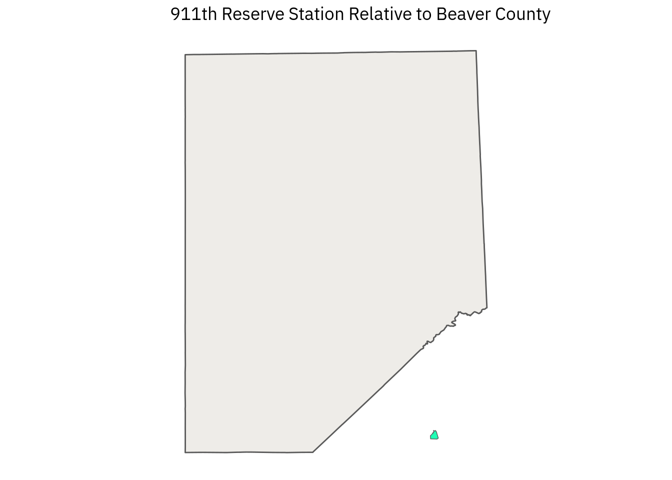
Plotting is more difficult when dealing with rails since the railway layer is a large collection of lines and it would be a great deal of work to identify the unique AREAID for each rail line running through Beaver County. For this layer, I think the best approach is to set geographic boundaries in ggplot’s coord_sf() function:
sf %>%
  ggplot() +
  geom_sf(
    data = bc,
    color = "#239b56",
    fill = "#239b56",
    alpha = .1
    ) +
  geom_sf(
    color = "#000000",
    size = .2,
    alpha = 1
    ) +
  coord_sf(
    xlim = c(-80.52, -80.15),
    ylim = c(40.47, 40.86),
    datum = sf::st_crs(4326)
  ) +
  labs(
    title = "Rail Network in Beaver County"
  )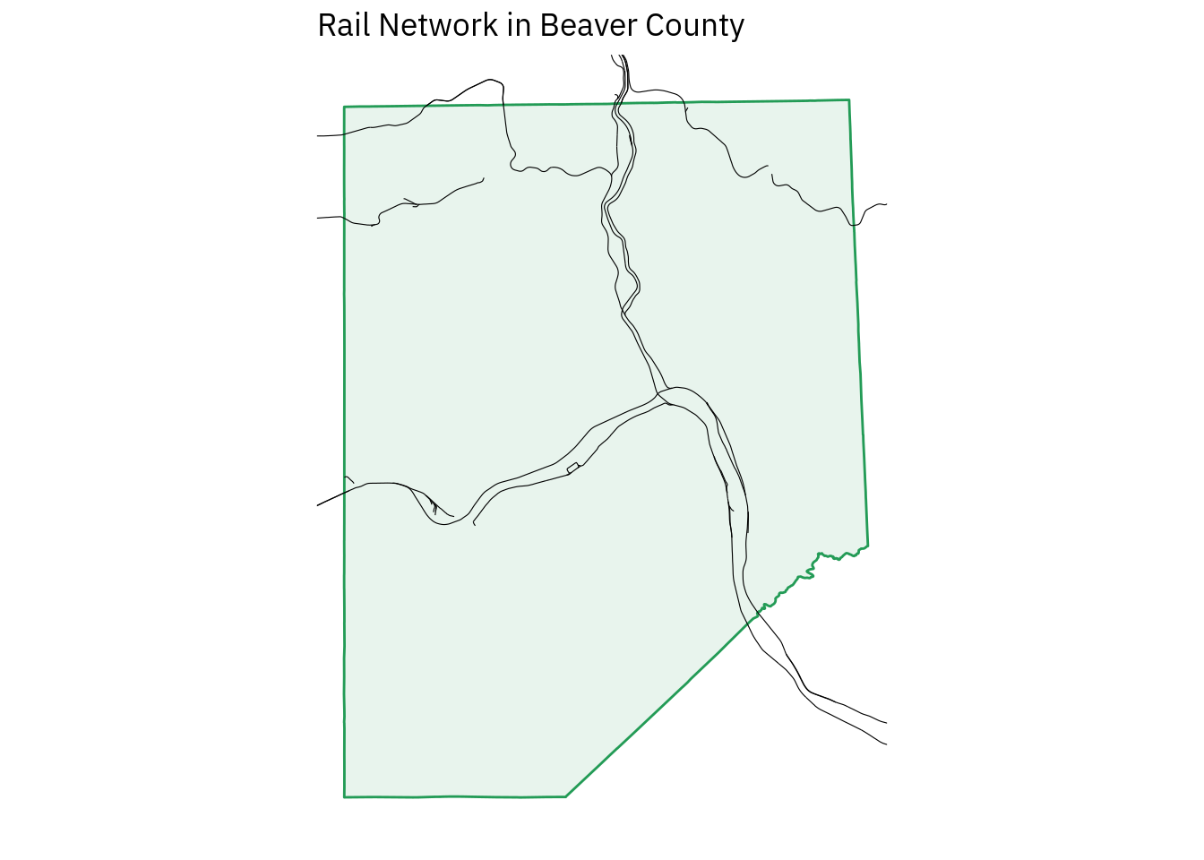
We would tighten up the visual appeal of this map if it was intended for publication, but for rough demonstration purposes this is sufficient.
Looking at the plot itself, I see several breaks in the continuity of the lines, which is not something that railway operators usually do intentionally. To confirm whether it’s an error, I looked at the data a little closer using plotly, and I believe the breaks represent a gap in the data rather than in the way ggplot2 rendered the lines.
Perhaps the gaps are present in old lines that are not in operation, but they are included for administrative reasons. If this were a relevant aspect of the analysis, I would investigate closer.
There are other national layers aside from the counties, military installations, and railways, but I believe that these three are sufficient to demonstrate the basic structure and challenges of working with national layers.
State level layers
Many TIGER layers that are more dense are shown at the state level. As with the federal data, layers are made of points, lines, and polygons that only occasionally coincide directly with county data. Here are a few of the state-level layers:
As with the federal data above, isolating specific cases from the data relevant to the analysis at hand requires a combination of using prior knowledge (e.g. knowing that Blackhawk school district is part of Beaver County but that Seneca Valley is not), examining the data with exploratory plotting, Google Fu, and so on.
As with the variable names in some of the federal layers, there are some aspects of the state-level layers that aren’t immediately clear to me. Particularly, there is a layer called “Places” whose polygons seem to correspond with settled areas (i.e. everything that is not an unincorporated area.
Since I am more interested in environmental analysis, the census-related layers like Census tracts and Congressional districts are of less direct interest to me, but their structures are all fairly similar to the layers listed above. State level layers appear to be the most common type, so familiarity with them is important for TIGER workflows.
County level layers
At the county level, the level of detail available in each TIGER layer goes up tremendously, so visual clutter becomes an issue. There is a combined layer called All Lines (written as edges in the archive) that contains all the geographical features tracked by the census in one layer. With appropriate lines and color, this layer is good for monochrome mapping:
sf %>%
  ggplot() +
  geom_sf(
    fill = "#145a32",
    size = .05
    ) +
  coord_sf(
    datum = sf::st_crs(4326)
  ) +
  labs(
    title = "All Lines in Beaver County"
  )
While this has the benefit of including a large range of data immediately, fine control is lost. All geometries are in a single column, so you couldn’t easily change the size or color of a single feature or feature type to highlight it. The data included isn’t clearly and consistently labeled, either.
That means it would take extra work to figure out what exactly certain lines represent. Some cases are named, and “Third Street” is pretty obviously a road, but others have blank name columns and only obscure variable names like MTFCC.
The MTFCC codes tells us what features mean in the context of the TIGER data, for instance S1400 represents “Minor, unpaved roads usable by ordinary cars and trucks.” Other code explanations are less helpful, like “P0001: Nonvisible Linear Legal/Statistical Boundary.”
Depending on the nature of the analysis, it could make sense to use dplyr functions to break out this data into separate layers. Alternatively, it’s possible to download the separate layers from the Census site, import them as sf objects, and modify them individually before combining them into one map. I prefer this latter approach.
To demonstrate building up a map this way, let’s make one that combines layers for line water (i.e. small creeks and streams), area water (ponds, lakes, rivers), all roads (including “minor, unpaved roads usable by ordinary cars and trucks”), and school districts. We’ll plot these on top of the county outline from the national data set.
sf_bc %>%
  ggplot() +
  geom_sf(
    color = "#732700",
    fill = NA,
    size = 1
    ) +
  geom_sf(
    data = sf_roads,
    color = "#ffac33",
    size = .05,
    alpha = 1
  ) +
  geom_sf(
    data = sf_areawater,
    color = NA,
    fill = "#3e721d",
    size = .5,
    alpha = .3
  ) +
  geom_sf(
    data = sf_linearwater,
    color = "#3e721d",
    size = .2,
    alpha = .3
  ) +
  geom_sf(
    data = sf_unsd,
    color = "#55aaff",
    fill = NA,
    size = .6
  ) +
  coord_sf(
    datum = sf::st_crs(4326)
  ) +
  labs(
    title = "Beaver County School Districts"
  )
This was pretty fun to make. I’m not trying to apply “real” cartographic practice here, since there are a lot of semantic conventions that I don’t understand well enough to actually use. In ggplot, the details of each layer (called aesthetics) can be customized heavily, and this flexibility is a big reason the Grammar of Graphics (the gg in ggplot) approach has been successful.
I’m still very much a novice in visual design, so I played around with color here to try and break myself from the lazy conventions of “blue water, green trees, dark colored roads.” I also played with the alpha (transparency) layer to deemphasize the water and roads while emphasizing the school districts.
Mapping like this is a good way to look at the layering approach used by both ggplot2 and mapping software. The grammar of graphics approach pairs well with cartography and is very intuitive: take the Beaver County outline, then place yellow roads on top of it. Then put green lakes and rivers on top of that. Finally, add blue school district boundaries and a title.
Editing maps with ggplot is super simple, with the biggest limitation being the time it takes for drawing operations to complete. Other feature layers are simple to add, particularly text with geom_text(). I did not add text to this plot because the work of managing text layers is one too many items to juggle at the moment.
I will work with text more later, however. Thinking more broadly about data, it would be possible to add any almost plot that ggplot2 can render to a map, so it’s totally possible to analyze data and plot the results right on a given point.
Conclusion
When building maps, it’s necessary to have accessible base layers, preferrably ones that do not require expensive licensing and which work at the scale(s) that will be eventually used. The TIGER shapefiles are a good start for US-based mapping and any work that involves Census-related data.
TIGER does not include extensive information on physical features, but the layers it has are sufficient for a great amount of mapping work. When mapping information that requires a map of features from the local level up to the national level in the background for reference, TIGER data should be more than sufficient to get the job done.
For this post, I used ggplot2 exclusively to map for consistenty’s sake, but also because I am most familiar with it and because I am curious about how its various extensions work (or don’t work) with cartographic workflows. I want to explore the US Geological Survey’s The National Map (TNM) next, but then I’d like to explore alternative tools.
There is a great deal of variation between major mapping packages, and while ggplot is excellent, I do not want to limit myself. While ggplot has some interactivity when combined with plotly’s ggplotly() function and possibly ggiraph?, there are many other places where flexible interactive maps are necessary. tmap in particular seems quite powerful.
There is also a great deal of work I will do once I’ve created basic maps: using text labels and icon overlays like route numbers, and symbols for features like hospitals, airports, or forests. Eventually, I will start working on more meaningful analysis that requires using other sf columns, joining separate data frames together.
Even with some basic knowledge and effort, I am pleased with how much I can do and impressed with the power and flexibility of the tools and data available. I’m looking forward to doing more.